Mun2:
This is quite a simple concept without too much moving going on- simply random images rotating and changing into other objects- however the use of laser-style lighting makes the effect very attractive. The bright colours work very well with the dark background, and the images suit the style and pace of the music in a way.
Monday, 31 March 2014
Research - Idents II
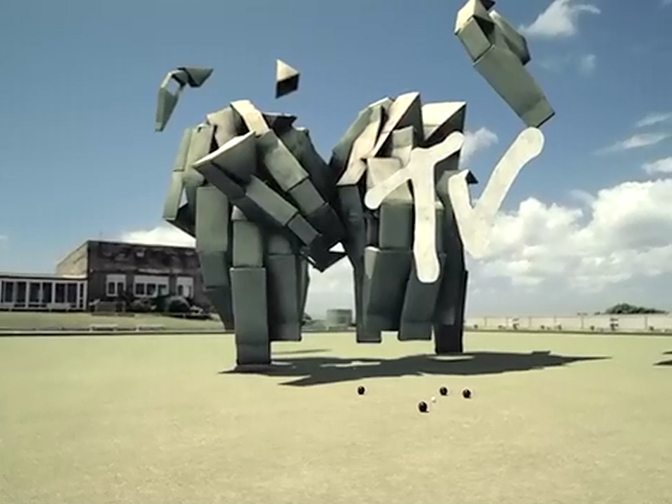
Idents for MTV:
This is quite a surreal example, and focuses a lot on the photographic side of compositing. These computer generated shapes contrast greatly with the realistic background, but they don't look out of place thanks to the attention paid to both lighting and shadow-- something to take into account when I set up my scene. The colour choice sort of makes the shape look like skeleton hands to me, which is pretty cool.
Another selection of animations, for an MTV top 10 countdown. They're all tied together by the same visual theme, which I think work very nicely as second-long snippets between music videos. The flashing lights look works really nicely with the reflections on the other shapes and use of glows and shadows.
Research - Idents.
Fuel TV Ident by Adam Haynes:
I love the sense of dimension and perspective in this clip. It truly feels like you're travelling with the camera. The dramatic switch from calmness and life to dark destruction is also very striking, and all the more potent once the green shoot begins growing again from the wreckage.
Aesthetically I love the 3D cel-shaded style, it gives a strong stylistic quality with the use of dark, thick outlines.
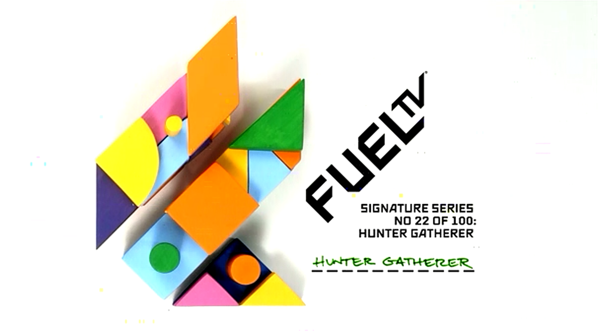
'Hunter Gatherer' for Fuel TV:
This stop-motion piece is a lot more abstract, and matches the animation to the rhythm of electronic music. The parts with the hand have probably had frames taken out to preserve that 'jerky' style and it works very well with the song. The building block look and chosen imagery (the keyboard, phone etc) is simple but very aesthetically pleasing.
Friday, 28 March 2014
Inspiration - Nychos
Nychos is a street/graffiti artist who focuses on anatomical designs, often dissecting creatures within his illustrations and using bright, detailed colouring for a lurid, even gory effect.
I love the attention to detail paid to the skeletons and other innards. It contrasts quite nicely with the often cartoonish faces of the animals and the fact that many of them are typically quite cute creatures. I'd love to incorporate more of these detailed and gruesome elements into my own illustrations, since I also like working with vibrant colours and slightly darker themes.
Compositing Progress
For the compositing unit so far I've set up a few scenes using photos from my holiday in Turkey.

First I set up the floor and sky planes and used the compositing tags to get the perspective of my shapes and the lighting right.
For now I've just set up a cube to get a feel for how my animation will eventually look on the background itself. Here are some shots to show the settings and tags applied to the materials/planes.

My second one is a similar scene but with different lighting and perspective.
Before I make any decisions regarding the animation I'll be sketching some designs for what might suit the scenery. I'm thinking ice or glass blocks for the second one, and perhaps something organic and fluid for the first- maybe tentacles or even plants?
Thursday, 27 March 2014
Essay Research - Video Sources
A selection of videos that have aided my research into anime/manga, especially the cultural and economical aspects that directly relate to the success of this industry both in Japan and worldwide.
Work Plan 27/03 - 04/04
Since I've been AWOL for quite some time I now have a significant amount of work to do before finishing up the year in April. I've already gone over what I need with my tutor and have a general to-do list, but here's a breakdown of what I'd like to have finished off before we break up for Easter:
- Complete the essay I'd started about the Japanese Anime industry (by tomorrow or Monday at the latest- this thing NEEDS to be out of the way),
- Finish up stuff for Look Book before we break up for Easter (04/04), including choosing my five favourite pieces of work and writing a bit about myself,
- Finish the Compositing module and get it handed in before Easter),
- Brainstorm potential ideas for my entry to the Young Illustrators Award 2014,
- Start organising the rest of my work for my portfolio, begin making comments on each piece,
- Creative CV,
- Research into potential job opportunities/placements/etc.
- Keep updating here- research, inspiration, work plans, thoughts, skills, general progress.
Profile Picture - Student Look Book 2014
First post in a while, I know. I've had a lot on my plate but now I shall be pressing on for the final stretch of this course.
Anyway I've gotten myself back in the zone by drawing the 'profile picture' we had to do for the student Look Book, using FireAlpaca and Photoshop:
I'm pretty pleased with how it turned out visually, all in all, and I definitely feel like it represents me! Next thing to do is write a short description of myself as an artist and choose my top five pieces of work to go into the book.
Subscribe to:
Comments (Atom)


