Showing posts with label illustration. Show all posts

Thursday, 10 April 2014

Illustration Friday Entry - Theme: Survival.

I heard about Illustration Friday via Facebook when one of my classmates submitted a piece. A theme word is posted once a week, and anyone can post a piece of art portraying their interpretation of the word until the next Friday.

This week's theme was 'survival', so I came up with the concept of a drowning man who begins to transform, adapting to the water in order to survive.


I only heard about this challenge tonight so my entry ended up a little rushed- however I think it's a great way to keep up practice, see the work of other artists and come up with new and original designs. I'd definitely keep checking the themes and posting my entries in future as it might be a good way of getting some exposure among other regular users.

Thursday, 27 March 2014

Profile Picture - Student Look Book 2014

First post in a while, I know. I've had a lot on my plate but now I shall be pressing on for the final stretch of this course.

Anyway I've gotten myself back in the zone by drawing the 'profile picture' we had to do for the student Look Book, using FireAlpaca and Photoshop:


I'm pretty pleased with how it turned out visually, all in all, and I definitely feel like it represents me! Next thing to do is write a short description of myself as an artist and choose my top five pieces of work to go into the book.

Thursday, 31 October 2013

More model sheet progress~

For the final model sheet I've decided to focus on Scavenger's shapeshifting ability. Since it has a limited range of poses, I thought it would be a lot more interesting this way, and it will provide good reference for me later when it comes to animating the transformation from bird to humanoid.

The outlines so far:


So far I think it looks okay, though the lines for the last couple of drawings will need to be tidied up later since I started getting a little tired (oops). But I do think that the drawings portray the transition quite well, and would serve as a nice reference for later animated morph tests.

Next up, colouring!

Saturday, 19 October 2013

Development - 'The Scavenger'.


This is the first time I've drawn this character entirely digitally, and although I love the scrawly style of my traditional drawings I feel as though I've gotten too carried away, when in fact the smooth, stark tones lend this character a more sinister presence. The lack of detail in the body also makes it look more 'ghost-like' than before. 

As far as the background goes, playing with various textures and blending modes has yielded a nice result. I'd definitely like to make the model sheet for this character dark and grungy, though I'll be experimenting with some mixed traditional media in order to make it truly unique.

Character design- 'The Scavenger'.

1.
2.
3.
By putting together all the quick sketches of this character since its conception, I can see how its developed and improved over the months. The shape of the body has gone from simplistic and smooth to more skeletal with a more obvious 'robe', as we can see by the hood and the way it clings to the creature's bones. 

It has also developed proportionally; after a lot of uncertainty regarding just how tall 'the Scavenger' would be, I've come to realise that this character would suit having a body that's ever-changing and generally intangible- other than the head and claws, of course.

This has led me to consider further what would be the best technique for animating such a creature. I'm in the process of creating a cut-out style test in Adobe After Effects using my grungy pen and marker sketches, but in order to achieve the exact consistency I want, I'll definitely need to experiment with a wide range of medias and research further into existing designs.

Monday, 29 April 2013

General Inspiration - Max Gärtner

Painter, illustrator and character designer. He has a very bold and detailed style, often based on nature but with a very modern and surreal edge.


His illustrations are very busy and often look as though they're made up of one long piece of string, giving a very loose visual effect. He uses white space as a stark contrast to the masses of heavy black lines; this along with the direction of the strokes cleverly gives a sense of depth and movement to the work. I think the way he made the birds head out of many bird's heads is very cleverly done, and I like how sections of solid black are added for the eyes. My favourite piece I saw was actually the gorilla one (middle), because I found the watercolour wash worked very nicely with the black lines. I also like how the shape of the snout on this one was quite messily sketched in as it differs to the crispness of the fur.

General Inspiration - Sue Doeksen

An Amsterdam-based designer who works in various mediums but retains a very colourful, simplistic but busy style.


These pieces all have a very similar look to them, and yet all were created differently- one digitally, one using cut paper and the other as what appears to be a painted mural. This shows her style is very versatile and is applicable to various functions. I like how cute the designs are, and how there are many hidden characters within a single piece. The colours work nicely without outlines and give the work a flowing look.


These designs blend cute and creepy quite nicely while having some humour about them. Again the style remains fairly constant but these posters show that the designs work well individually as well as part of a larger piece.


General Inspiration - Will Sweeney

London-based illustrator and graphic artist who specialises in clothing graphics, comics/webcomics, animated videos and music packaging.


I like the detailed linework in these character designs, especially how it is brought to life by the vibrant use of block colours. The faint screentoning gives a very retro/comic feel while the lurid colour palette is reminiscent of vintage horror movie posters. This style compliments the gruesome design of the creatures very well. I also like how the fruit/vegetable elements of the monsters are quite subtle so you have to look closer to spot certain details, and how it contrasts with the aesthetic of metal/machine parts. The same goes for dressing the monsters/food creatures in typical street fashion- I particularly like how the mushroom monster has nothing but a pair of Converse on. The broccoli biker is also a favourite.


These illustrations show even greater detail as far as the linework is concerned. Again, the lurid but flat colours gives a very surreal edge to the drawing, especially since they clash a lot with the lineart itself. The pencil drawing beneath it is no less surreal, and shows even greater detail with the more subtle shading and the sheer busyness of the piece.

I would definitely consider using vibrant colour with future drawings since my own style is often heavy on the outlines and drawn detail.


An example of Sweeney's work in another media. I think this design translates well to a figure, which is always a factor to consider when creating my own designs. Will it work well as figurines and translate well to 3D programs?


Saturday, 27 April 2013

Sketching.

Since I missed out on some of the life drawing classes, I've been gathering photos of my various influences to use as reference for my drawings.


For this drawing of Björk I limited myself to only a few minutes of sketching in order to capture the basic form, along with the most dramatic shadows and highlights. I quite liked using marker to draw since it's nice and bold, and I think the sketchiness of it would look quite nice with a delicate wash of ink or watercolour. Even so I do also like the messy pen shading I added after the initial marker sketch.

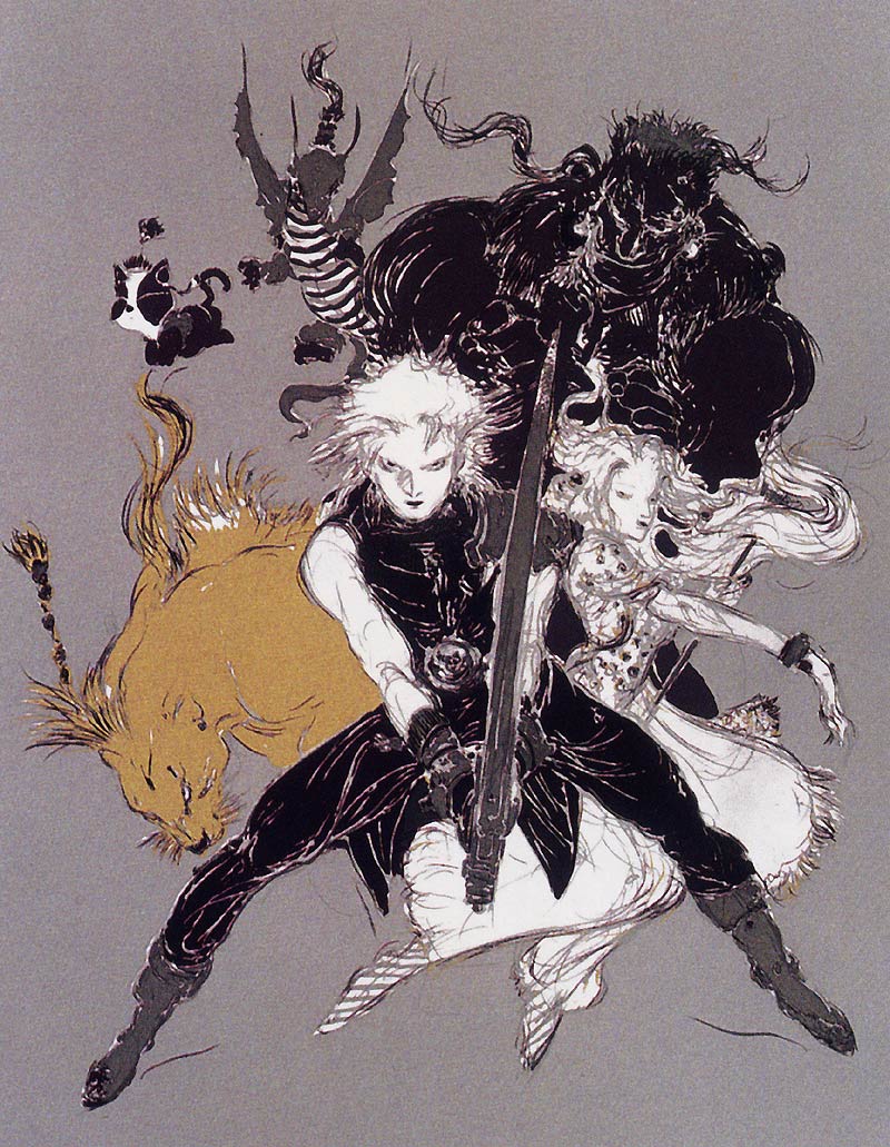
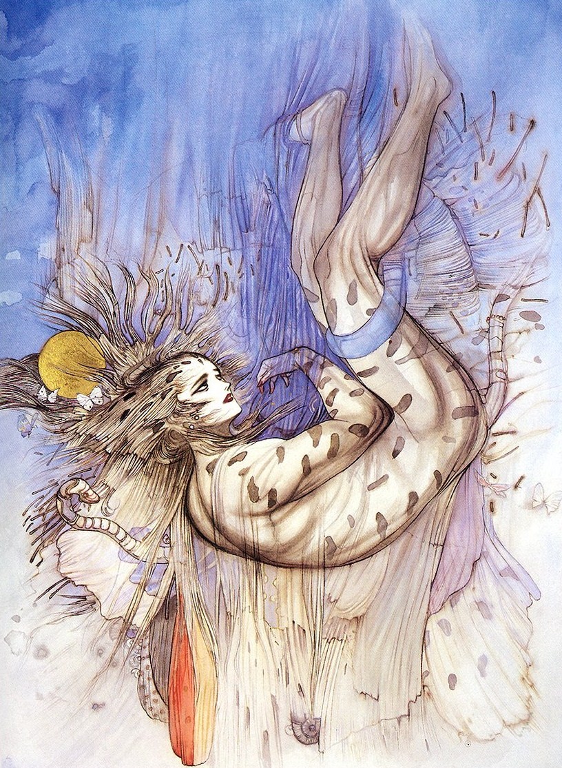
General Inspiration - Yoshitaka Amano

A Japanese artist who is well-known for his work on the Final Fantasy game series.


I love how he captures movement and form with such freely drawn lines, and yet there is a certain level of detail and delicacy to his work so that it works even with very minimal colouring and shading.


Conversely many of his illustrations are highly polished and refined, such as the above. I find the soft, whimsical colouring to be a perfect contrast to his use of bold and often highly detailed black outlines. The influence of traditional oriental art and mythology is present in the linework and in the figures he draws, which often seem to be a cross between beautiful humans and spirits/demons.

Outcome of Character Design unit.


An update of how my character for the character design unit ended up looking. As late as I am in updating this, I'd like to reflect on how pleased I was with the outcome. The character ended up well fleshed-out both in style and substance; he's definitely a personality I feel I could write some interesting and funny short stories about in the future.


As far as translating the design to 3D was concerned, time constraints meant I was unable to fully build the character; however I was able to build the parts necessary to rig the entire body. Here you can see that I was able to give my character the reclining posture that I tended to draw him with by adding extra controllers in the spine. The only things I slipped up on were the head and foot controllers- fortunately this is something that could easily be fixed at a later date by changing the direction my character faces and re-organising the hierarchies. Overall I was pleased with how he translated to a 3D model, and was able to animate him with a basic walk cycle for the deadline.


Tuesday, 19 February 2013

Expressions.

I've drawn out some basic expressions for Rutherford along with a few different angles for his head/face, then done some simple colouring to try and work out how the lighting would work and whatnot.

A staple part of Rutherford's expressions has become the little line that shows the quirk of his upper lip. I think it gives him that snootier edge. I've tried working with how the ears can show expression too - flattened for sadness or anger, upright for excitement or laughter, a slight curl at the tips for vague interest. Drooping the nose/snout also works for portraying sadness or disappointment, while turning it up more dramatically can give either a pompous or mischievous look depending on the rest of the expression.
I'll be taking a look at how other animal characters' expressions are handled in cartoons for more potential ideas regarding my character. Using the shape of the face and ears itself seems a good way to give him more life and show his true thoughts, mostly since his eyes are very simplistically drawn and often neutral/bored-looking.

Monday, 18 February 2013

Character poses.

I've been playing around with how my character poses and moves - having such a long-limbed creature with such a short torso has been a little awkward to position at points, however I believe I've managed to capture his personality quite well with just a few pose ideas.


Here I went for some basic poses - walking and sitting. I've decided that to have him completely reclining during most of his daily activities is a must. It perfectly portrays his lax attitude, while the elegant way he holds his legs and his long strides give that air of haughtiness that characterises him. Either way, he doesn't seem particularly impressed despite the fact he has it all. When it comes to animating my 3D model, I feel that the length of these limbs will suit more elegantly jerky movements rather than being completely smooth (á la Tim Burton, perhaps?)

For these poses I've gone with a slightly different approach - looking at how beneath the poise and loftiness Rutherford is, at the end of the day, a silly spoiled brat. The demanding poses on the right hand side show the extremes of this - very rigid poses compared to his usual languid stance in a blatant display of selfishly commanding his unfortunate butler's attention. On the other hand the pose on the left depicts a childish glee in him sneaking some extra booze after bed-time while already intoxicated (even more childish is the fact he still needs a bed-time) - however in this respect we also see a glimpse of Rutherford acting how his species would in nature: sneaking and prowling. No matter how ridiculously pampered this character is I decided it was a must that he display some fundamental fox-like movements.
These pose sketches have really helped to set my character's personality firmly in mind in a much broader spectrum than simply a snooty aristocrat. I feel like his childish side, while annoying, makes him also somewhat endearing when we consider how dignified he strives to appear for the most part.

Secondary characters.

In order to get more of a general feel for the setting in which my character (Lord Rutherford) dwells, I've decided to sketch out some secondary characters he is likely to encounter on a regular basis.


This is Edgar - Lord Rutherford's butler. He has served the Rutherford family for three generations now, and is avidly loyal despite his impressive age and short-sightedness. This old hare is forever concerned about Rupert's behaviour - from his frivolous spending of his family's treasury to his combined laziness/childishness/lack of responsibility. And let's not forget how monumentally sheltered and thick the fancy fox is - he can hardly put his own clothes on without help from his faithful yet exasperated servant, never mind mingle among the commoners.
A nameless beggar - one of the worst of inhabitants of the town of Oakvale which lies at the foot of Rutherford Ridge. This sort of poverty is rife; and while Edgar will manage to pester Rutherford into showing some charity for the sake of the family image, the pompous young Lord will often handle these lowest-of-the-low peasants with an expression of disgust and insensitively cast his small change to the ground rather than in their tin. Desperate as these poor folk are, they have no option but to graciously accept what they can and make do with it... Until next time.
More character ideas may come depending on my time constraints (though the deadline approaches fast), since the world Rutherford inhabits and the people he interacts with fleshes him out as a character more on a whole, and pinpoints his specific character traits based on his prejudices etc.

Character elevations by hand.

Here we have the final, in proportion elevations for the character sheet, ready to clean up and colour in Illustrator and/or Photoshop.

Line practice.

My first time creating vector linework for a character. While the brush I applied has caused many gaps in the lines to occur, I definitely think the smooth, tapering lines suit the character's elegance. Not bad for a first attempt.

Oh, and his name is Rupert Rutherford.

Sunday, 17 February 2013

Character concept - Fox

So, here are the first sketches I drew for my fox character~


The version on the right hand side was my very first sketch. At the time I'd wanted to create a character who was rich, snooty, horrible and generally not nice at all. The short, hunched stature and un-tucked shirt lends to that vibe, I feel, along with the exaggerated angry eyes. The version on the left was a test of the more tall, elegant and gentlemanly counterpart to this character.

Not quite happy with that design, but still attracted to the thought of making my character a fox, I decided to turn around the personality a bit. He'd still be very haughty by nature, but instead of being contemptible he'd be polite and genteel while still remaining otherwise naive to the troubles of those less moneyed than him. There would be flaws in the sense that he would be well-meaning yet manage to appear cold and insensitive whenever he attempts to 'help' others - for example he would cast coins at a beggar's feet rather than stoop down to place them in a tin or hat. With this in mind I made the character more elongated and smooth, with a refined posture and a pose that is laid-back but not uncouth. The original, shorter version could perhaps be kept in mind as an idea for how this character becomes as he grows old - perhaps he will lose his rose-tinted view of the world and become cynical or mean-spirited.

After the initial sketch which would determine the general proportions and tone of my character, I redrew him again with the laid back pose I mentioned. It was at this point that I added props such as a cigar and brandy glass, which I felt were perfect items to show his privilege above others. (Another potential prop I have in mind would be a cane or pocket-watch.) After drawing the close-up sketch to the right, I decided I would prefer his head to be completely smooth, with no styled curls. I then drew the side view to see how it would look, and was pleased with him having a smooth teardrop-shaped head. Here I also decided to give him a smooth tail with the idea in mind that he would be far more groomed than a mangy street fox. His tail would by styled, the fur would be possibly be smoothed down with products, and he would always hold it aloft and elegantly curled to show his refinement.

With the basics of the character's proportions and character in mind, I must next draw various poses and expressions that will serve to develop him further - that and decide on a name, of course.