Showing posts with label inspiration. Show all posts

Friday, 4 October 2013

Inspiration.


Music video for 'She is the New Thing' by The Horrors. I immediately loved the grungy mixed media style, which is part film in areas but overlaid with what looks like ink splatters and other bold, dark shadows. The stark black and white colour scheme works excellently with the contrasting flashes of bright red, and is definitely something I'll consider when experimenting with colour and tone in my own work.

As far as the animation itself is concerned, I love how the characters and creatures seem to be constantly dripping and leaving trails of jet black. This is definitely an aesthetic I'd like to recreate in the model sheets for my ominous bird-like character.


Tuesday, 30 April 2013

E Stings inspiration.

When I was thinking up a concept for my Sting, I initially thought about the colour purple. I remembered a nice pair of purple gloves I own, decided I wanted to involve them in my idea somehow and from there began to think of ideas that could include the use of hands.


These sequences immediately came to mind. In South Park I liked how one of the opening themes showed the hands actually arranging the pieces of the characters along with the stop-motion equipment.
The second video is from an old show I used to watch as a kid called Zzzap! and I always loved the Handymen characters. Watching some of those sketches inspired me to think more about the visual theme of my idea, and so it was decided it would be magic.

The intention for this idea is to create it using stop-motion techniques, though I'll also be thinking of including some drawings and taking stills to edit digitally, giving me an idea for how I'll edit the look of my film after shooting.

Monday, 29 April 2013

General Inspiration - Max Gärtner

Painter, illustrator and character designer. He has a very bold and detailed style, often based on nature but with a very modern and surreal edge.


His illustrations are very busy and often look as though they're made up of one long piece of string, giving a very loose visual effect. He uses white space as a stark contrast to the masses of heavy black lines; this along with the direction of the strokes cleverly gives a sense of depth and movement to the work. I think the way he made the birds head out of many bird's heads is very cleverly done, and I like how sections of solid black are added for the eyes. My favourite piece I saw was actually the gorilla one (middle), because I found the watercolour wash worked very nicely with the black lines. I also like how the shape of the snout on this one was quite messily sketched in as it differs to the crispness of the fur.

General Inspiration - Sue Doeksen

An Amsterdam-based designer who works in various mediums but retains a very colourful, simplistic but busy style.


These pieces all have a very similar look to them, and yet all were created differently- one digitally, one using cut paper and the other as what appears to be a painted mural. This shows her style is very versatile and is applicable to various functions. I like how cute the designs are, and how there are many hidden characters within a single piece. The colours work nicely without outlines and give the work a flowing look.


These designs blend cute and creepy quite nicely while having some humour about them. Again the style remains fairly constant but these posters show that the designs work well individually as well as part of a larger piece.


General Inspiration - Will Sweeney

London-based illustrator and graphic artist who specialises in clothing graphics, comics/webcomics, animated videos and music packaging.


I like the detailed linework in these character designs, especially how it is brought to life by the vibrant use of block colours. The faint screentoning gives a very retro/comic feel while the lurid colour palette is reminiscent of vintage horror movie posters. This style compliments the gruesome design of the creatures very well. I also like how the fruit/vegetable elements of the monsters are quite subtle so you have to look closer to spot certain details, and how it contrasts with the aesthetic of metal/machine parts. The same goes for dressing the monsters/food creatures in typical street fashion- I particularly like how the mushroom monster has nothing but a pair of Converse on. The broccoli biker is also a favourite.


These illustrations show even greater detail as far as the linework is concerned. Again, the lurid but flat colours gives a very surreal edge to the drawing, especially since they clash a lot with the lineart itself. The pencil drawing beneath it is no less surreal, and shows even greater detail with the more subtle shading and the sheer busyness of the piece.

I would definitely consider using vibrant colour with future drawings since my own style is often heavy on the outlines and drawn detail.


An example of Sweeney's work in another media. I think this design translates well to a figure, which is always a factor to consider when creating my own designs. Will it work well as figurines and translate well to 3D programs?


Saturday, 27 April 2013

General Inspiration - Esad Ribic

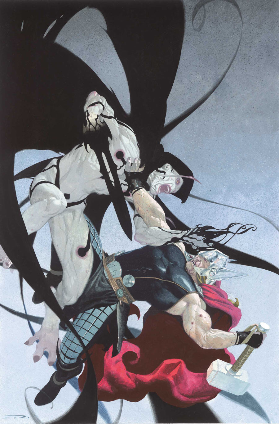
An artist who works for Marvel, known for his work on titles such as 'Thor and Loki: Blood Brothers' and the ongoing 'Thor: God of Thunder'. 

A quick sketch by Ribic sold at a convention panel. I like how he only draws very faint pencil guidelines before applying watercolour but still manages to capture shape and lighting with nice detail. Still you can see where details such as the eyes have been penciled in with greater precision which makes those features stand out well.

Samples of comic cover art. The level of detail in these traditional pieces is beautiful, especially in the muscle definition. I like how this contrasts with the bold, black shadows on the monster, the red cape and the stark, bleak backgrounds. Ribic stands out from many comic artists with his traditional style, especially since he doesn't adhere to the usual thick black outlines and bold colouring of many other Marvel artists.


A two page spread from inside one of the comics. Here you can see that the art is digital, most likely for time efficiency since issues are published monthly, and yet his delicate style isn't compromised. The art still has a gentle and attractive painted look to it, and the higher detail in the linework more than makes up for any that's lost in the colouring process. Even so the lighting on the ridges of the creatures spine is stunning, and the fade in colour and line towards its back end gives a strong sense of perspective.

General Inspiration - Yoshitaka Amano

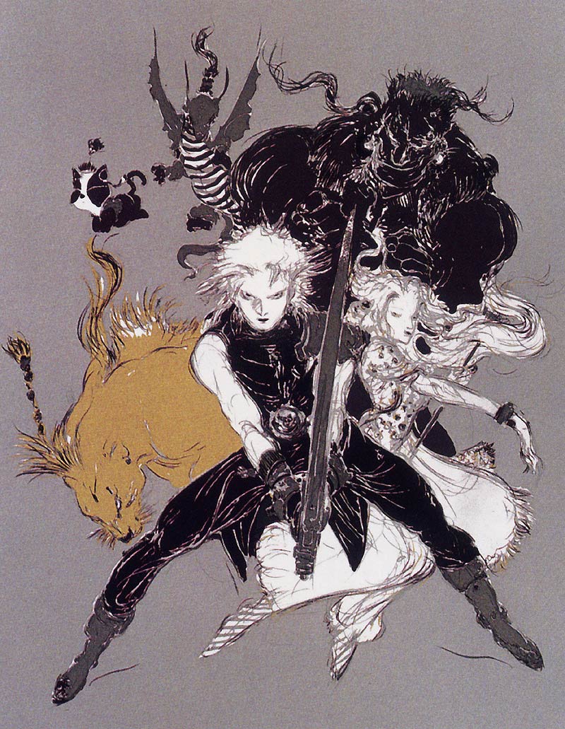
A Japanese artist who is well-known for his work on the Final Fantasy game series.


I love how he captures movement and form with such freely drawn lines, and yet there is a certain level of detail and delicacy to his work so that it works even with very minimal colouring and shading.


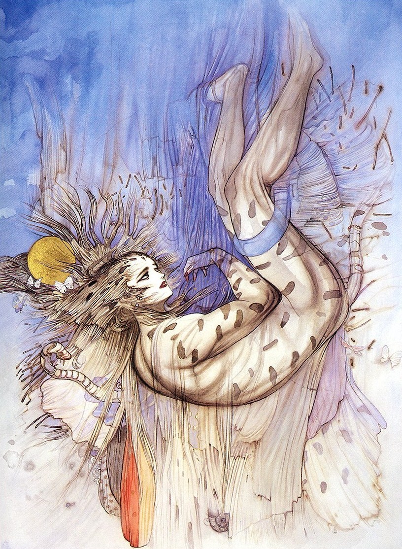
Conversely many of his illustrations are highly polished and refined, such as the above. I find the soft, whimsical colouring to be a perfect contrast to his use of bold and often highly detailed black outlines. The influence of traditional oriental art and mythology is present in the linework and in the figures he draws, which often seem to be a cross between beautiful humans and spirits/demons.

Monday, 18 February 2013

General Inspiration - Tokyo Plastic

I was highly entertained while researching some of the productions by this team while also slightly disturbed. All in a good way, though. I do have a certain love for the creepy and gruesome, after all.


On watching this for the first time, I was almost put off by how sickeningly cute this was. As beautiful as the smooth, shiny style was, it seemed far too much. 

Needless to say, I was surprised (a little more pleasantly than I'd like to admit) when the grumpy creature in the sky decided to make the little critters explode with some sort of heat ray. I find it both disturbing and amusing that the sun continues to beam happily in the background while the inhabitants of this cute and colourful planet screech in pain. Even their skulls are adorable. Overall, a genius idea. I approve.


Another somewhat disturbing sequence, this little fellow appears to have a mouth that smiles at the eye-creature, but it in fact turns out to be an eye socket by the end. There's something disturbing about creatures that are nothing but masses of flesh and human parts, and for that I like the design all the more  - along with the fact that the switch from mouth to eye socket is very cleverly done.
A more genuinely cute ad campaign. I found these two characters very endearing - I loved the shoe details like the laces and fabric types. It reminds me somewhat of the sackboy design from Little Big Planet.


Sunday, 17 February 2013

General Inspiration - Studio AKA

Studio AKA productions have some very creative examples of 3D character design, many of which are notable for the exaggerated bodily proportions and facial expressions.

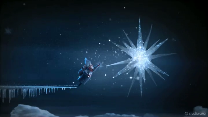
I like how the stars in this H Samuel ad campaign almost look like tissue paper. It makes it stand out nicely from the rest of the scenery. The motion of the character gliding on the ice is also very smooth and attractive.

The dancing movement of this character works well with the unusually long arms, giving a simultaneously funny and creepy effect.

The simplicity of the shapes that construct these characters' faces become surprisingly expressive with the simplest of changes. The slight difference in the eye shapes give that sinister look, while the lack of anything but a socket adds to it.


I find this concept both disturbing and very clever. The idea of wearing a smile is quite symbolic. I like how the dramatic lighting gives off an almost unnatural glow regarding the smiles.