I've drawn out some basic expressions for Rutherford along with a few different angles for his head/face, then done some simple colouring to try and work out how the lighting would work and whatnot.
I'll be taking a look at how other animal characters' expressions are handled in cartoons for more potential ideas regarding my character. Using the shape of the face and ears itself seems a good way to give him more life and show his true thoughts, mostly since his eyes are very simplistically drawn and often neutral/bored-looking.
Tuesday, 19 February 2013
Monday, 18 February 2013
Character poses.
I've been playing around with how my character poses and moves - having such a long-limbed creature with such a short torso has been a little awkward to position at points, however I believe I've managed to capture his personality quite well with just a few pose ideas.
These pose sketches have really helped to set my character's personality firmly in mind in a much broader spectrum than simply a snooty aristocrat. I feel like his childish side, while annoying, makes him also somewhat endearing when we consider how dignified he strives to appear for the most part.
These pose sketches have really helped to set my character's personality firmly in mind in a much broader spectrum than simply a snooty aristocrat. I feel like his childish side, while annoying, makes him also somewhat endearing when we consider how dignified he strives to appear for the most part.
Secondary characters.
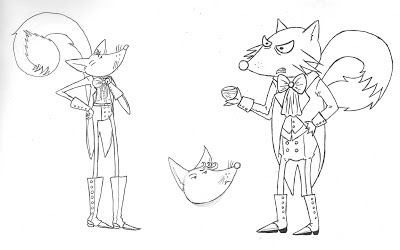
In order to get more of a general feel for the setting in which my character (Lord Rutherford) dwells, I've decided to sketch out some secondary characters he is likely to encounter on a regular basis.
More character ideas may come depending on my time constraints (though the deadline approaches fast), since the world Rutherford inhabits and the people he interacts with fleshes him out as a character more on a whole, and pinpoints his specific character traits based on his prejudices etc.
More character ideas may come depending on my time constraints (though the deadline approaches fast), since the world Rutherford inhabits and the people he interacts with fleshes him out as a character more on a whole, and pinpoints his specific character traits based on his prejudices etc.
Character elevations by hand.
Line practice.
General Inspiration - Tokyo Plastic
I was highly entertained while researching some of the productions by this team while also slightly disturbed. All in a good way, though. I do have a certain love for the creepy and gruesome, after all.
 |
| On watching this for the first time, I was almost put off by how sickeningly cute this was. As beautiful as the smooth, shiny style was, it seemed far too much. |
Sunday, 17 February 2013
Character concept - Fox
So, here are the first sketches I drew for my fox character~
Not quite happy with that design, but still attracted to the thought of making my character a fox, I decided to turn around the personality a bit. He'd still be very haughty by nature, but instead of being contemptible he'd be polite and genteel while still remaining otherwise naive to the troubles of those less moneyed than him. There would be flaws in the sense that he would be well-meaning yet manage to appear cold and insensitive whenever he attempts to 'help' others - for example he would cast coins at a beggar's feet rather than stoop down to place them in a tin or hat. With this in mind I made the character more elongated and smooth, with a refined posture and a pose that is laid-back but not uncouth. The original, shorter version could perhaps be kept in mind as an idea for how this character becomes as he grows old - perhaps he will lose his rose-tinted view of the world and become cynical or mean-spirited.
With the basics of the character's proportions and character in mind, I must next draw various poses and expressions that will serve to develop him further - that and decide on a name, of course.
Not quite happy with that design, but still attracted to the thought of making my character a fox, I decided to turn around the personality a bit. He'd still be very haughty by nature, but instead of being contemptible he'd be polite and genteel while still remaining otherwise naive to the troubles of those less moneyed than him. There would be flaws in the sense that he would be well-meaning yet manage to appear cold and insensitive whenever he attempts to 'help' others - for example he would cast coins at a beggar's feet rather than stoop down to place them in a tin or hat. With this in mind I made the character more elongated and smooth, with a refined posture and a pose that is laid-back but not uncouth. The original, shorter version could perhaps be kept in mind as an idea for how this character becomes as he grows old - perhaps he will lose his rose-tinted view of the world and become cynical or mean-spirited.
General Inspiration - Studio AKA
Studio AKA productions have some very creative examples of 3D character design, many of which are notable for the exaggerated bodily proportions and facial expressions.
 |
| The dancing movement of this character works well with the unusually long arms, giving a simultaneously funny and creepy effect. |
 |
| I find this concept both disturbing and very clever. The idea of wearing a smile is quite symbolic. I like how the dramatic lighting gives off an almost unnatural glow regarding the smiles. |
Subscribe to:
Comments (Atom)


